 Archives
The Seven Deadly Sins
 The fine people over at Quandl made me aware of their new campaign focussed on data presentation. As a fan of the ‘information scientist’ Edward Tufte and someone who has devoted a few years of his life to Structured Visual Thinking with John Caswell, I am always on the look out for software that can help us mortals better present our data in consistent, reliable and understandable ways. Guys like
Nathan Yau of Flowing Data just boggle my mind. It looks so easy. And then you try it.
The fine people over at Quandl made me aware of their new campaign focussed on data presentation. As a fan of the ‘information scientist’ Edward Tufte and someone who has devoted a few years of his life to Structured Visual Thinking with John Caswell, I am always on the look out for software that can help us mortals better present our data in consistent, reliable and understandable ways. Guys like
Nathan Yau of Flowing Data just boggle my mind. It looks so easy. And then you try it.
The fact is, Informative visualizations are truly powerful. Emphasis on ‘informative’, which is different to that curse of the internet, ‘the infographic’. (*)
Enlightened image thinking such as this one from David Somerville who took an idea and graphic from Hugh MacLeod and improved it, is what I am talking about. It is hard to improve on Hugh’s imagery when you look at his body of work, but this one does - and also resonated with me as a wonderfully simple story of the transformation from data to wisdom.
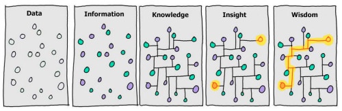 data to wisdom
And so to Quandl …
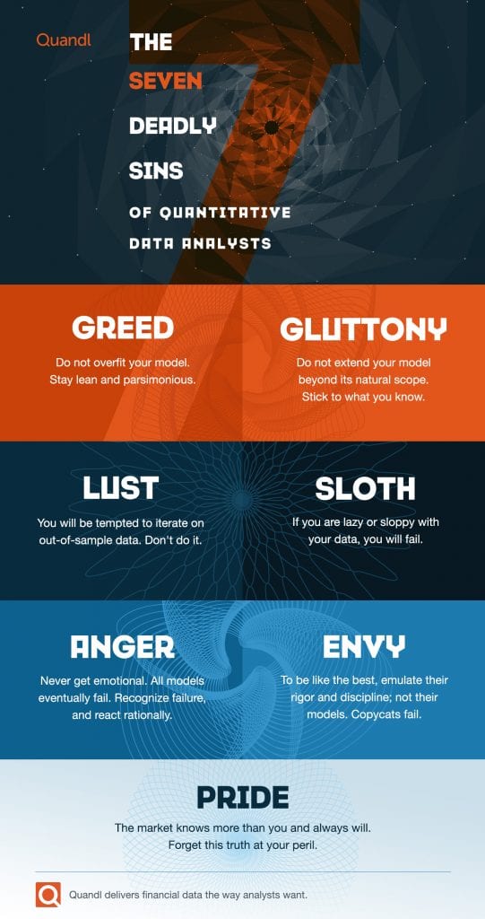 Quandl_7_sins_2x_v04
Quandl offers 20 million professional-grade financial and economic datasets from hundreds of publishers on one simple, easy-to-use platform. Quandl covers a mix of free data that is available to any user, and premium data that is only available to paying subscribers.
Their whole mission is to allow the likes of me ( and people a LOT brighter) get at raw financial data, and bring it all into the tool of my choice (from Excel through to Python and Ruby) and let me present and illustrate effectively. To quote a famous technology visionary … “It just works”.
As for the seven deadly sins, excellent advice to hold in your mind whenever you are seeking to take the data and transform it into wisdom, my personal favorite is …
Sloth : If you are lazy or sloppy with your data you will fail.
Truth - reminding me of the old adage that has stuck with me over the years
A politician uses statistics much as a drunk uses a lamppost - more for support than illumination.
But then I think most politicians are guilty of all seven of the deadly sins of the quantitative data analyst.
What do you think?
(*) IMO - Infographic is too often a misnomer, providing no ‘information’ and with graphic quality so poor that professional designers bust shake their heads in dismay.